
Services: art direction, illustration, graphic design
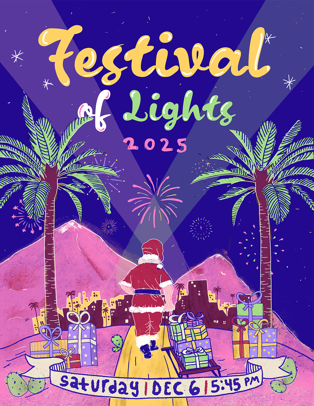
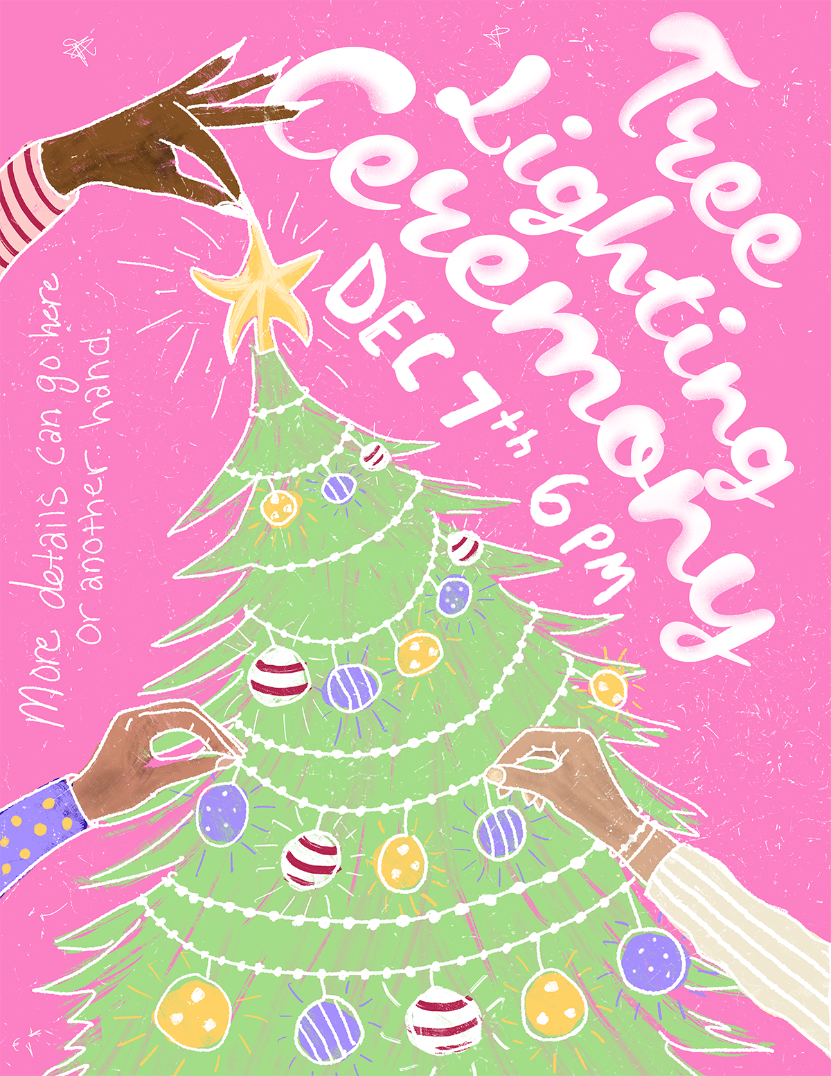
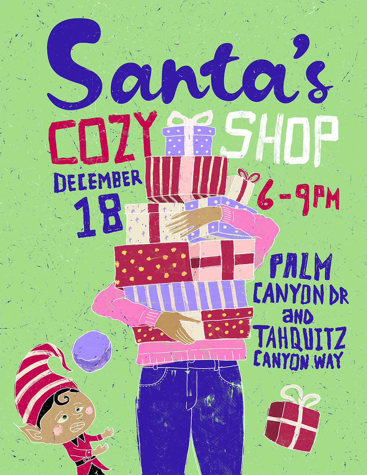
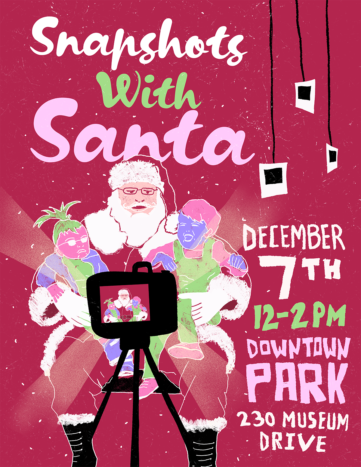
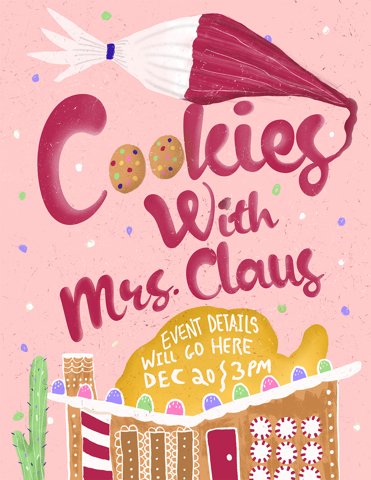
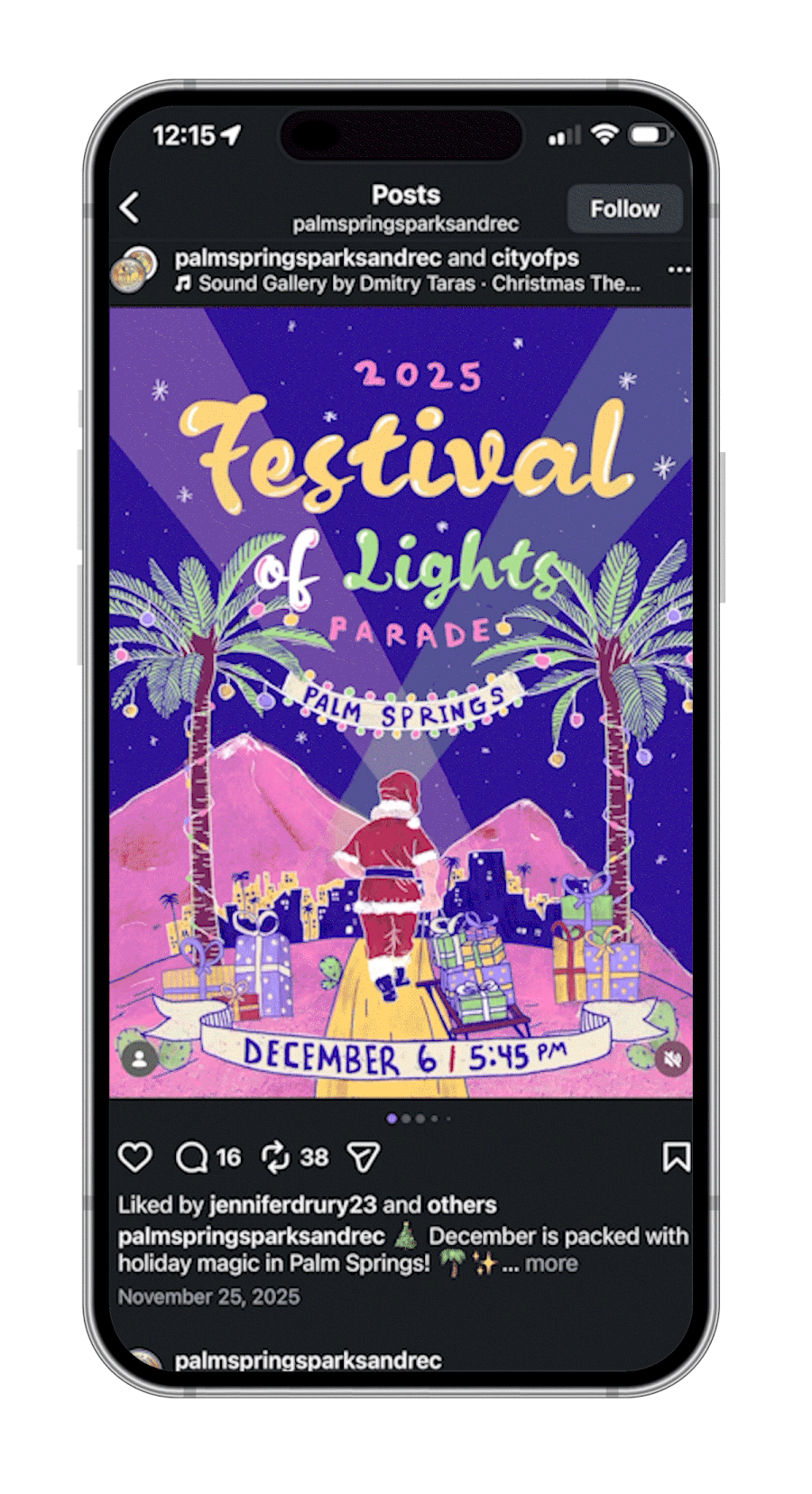
Working with the city of Palm Springs for their annual Festival of Lights parade was truly a career highlight for me. Not only was this a big client to land, but they chose to aesthetically have me lead this project with my illustration skills. A skill I really started developing 7-8 years ago. This event consisted of 5 mini events leading up to the main parade that brings in over 100,000 attendees yearly. (Scroll down to see all 6 flyers)
The Brief
The team at the City of Palm Springs Parks and Recreation Center were newly appointed and wanted to do something new and fresh for the festivals marketing. I pitched them 3 different themes and they decided to go with illustration. The ask was to have this illustration style reflect across all six flyers. The team wanted.the illustrations to feel warm, cozy and modern, while preserving the family friendly joy the city and festival exudes during the holidays.
Logo / Typography
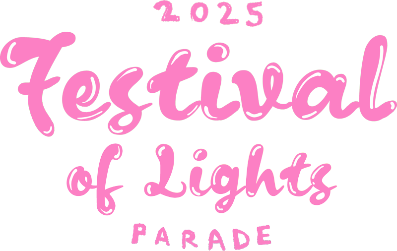
For all six flyers I used one font that I altered a bit, mixed with 2-3 different custom handwritten fonts I made with various brushes on procreate. This helped create a more unique and authentic design.
Color palette
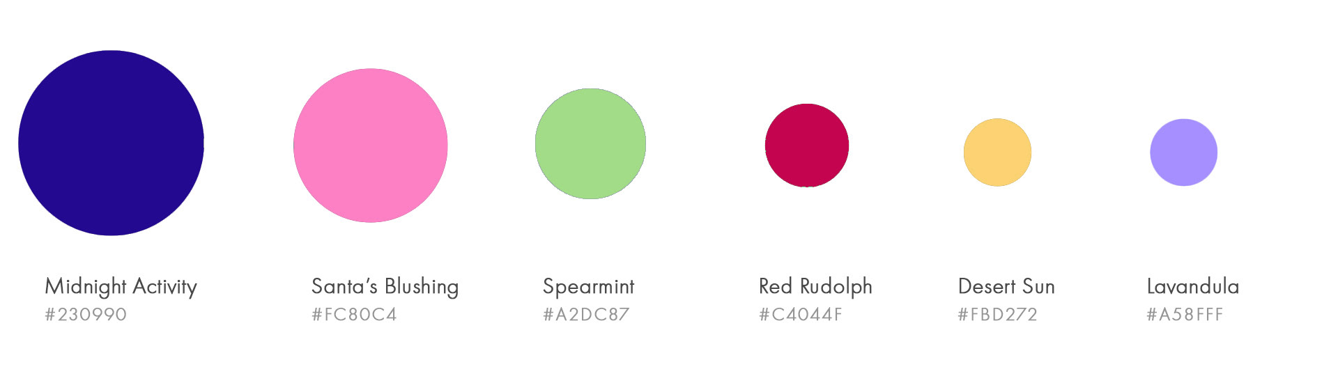
Originally the team requested I use the iconic pastel tones that Palm Springs is known for but I pushed back. The reason why was because they had asked for something modern and fresh and when they saw the final outcome they agreed that adding more saturation into the palette not only helps it feel more modern but reflects the true vibrance and diversity of the city today.
High Engagement Social Posts
These flyers created some of the most high engaging posts on the City of Palm Springs and The Parks and Recreation official instagram accounts.